A modern family house and its interior with a request for black-and-white tuning with elements of wood, which makes the large space with high ceilings more comfortable. In contrast to the originally planned rectangular layout, I designed both the bar counter and the dining table to be angled for several reasons. Firstly, the flat roof is overlain diagonally by another mass - I wanted to match this, albeit invisible, slant to the elements in the interior. if not the terrace in the exterior. Secondly, with the given positioning of the fireplace, the obliquely placed table does not block the view of the fireplace, on the contrary, it offers a view of the fireplace on arrival. Third, the angled bar counter is a more ergonomic and better communication option for the given floor plan, which also opens up the view to all three terraces.
Visualisation of a living room with elements of both wood and industrial style


Due to the number of windows and the overall articulation of the space, the entrance to the rear wing is hidden in the wood paneling in the floor decor. The storage space is entirely hidden in the access hall and, together with the lowered ceiling, forms a solid mass, highlighting only those elements that have a living room character. Throughout the interior, white, black, grey and wooden elements are rhythmically coordinated with each other.
Design of a modern fireplace with a seating area


Jobs

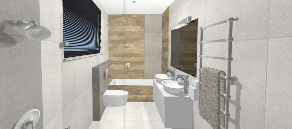
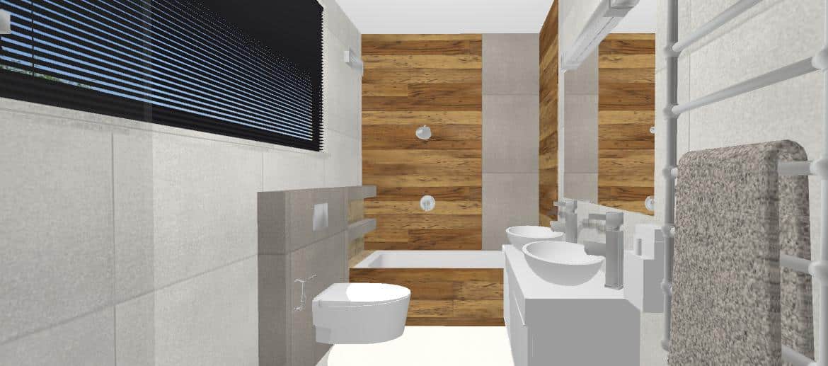
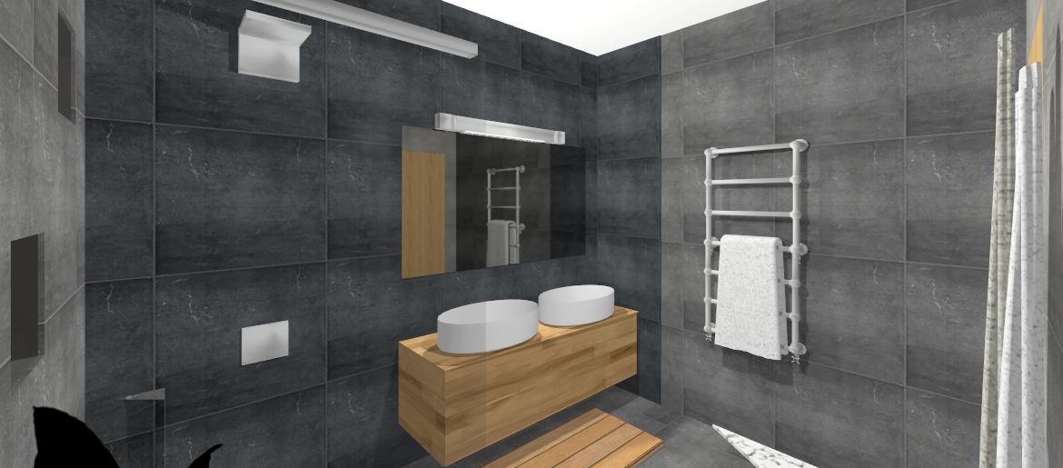
Girls bathroom with wood elements
I wasn't originally supposed to do this bathroom at all. The girls had a clear idea of the bathroom, which their parents respected. It was all about the massive use of wood tile and wainscoting combined with white gloss and textured tiles. However, when the requirement for "my look" arose I designed the bathroom according to my feelings, still respecting the original intention but also respecting the space as a whole (the layout of the bathroom was a given). It was a matter of applying the element of the wooden tiling so that it didn't overwhelm the whole space. So, first of all, I dropped the original wooden floor, which made the bathroom "lighter" overall. At the same time, I "broke up" the continuous back wooden wall by inserting a darker shade strip of standard tiling, and in turn, pulled the wood further along the full depth of the tub. The tiling laid out in this way alone gave the space a more interesting look.


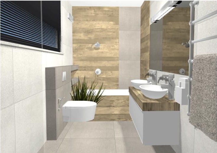


Next, it was only logical to use geberite and shade the two continuous shelves above the tub. By reapplying the darker shade to the geberite and shelves, a connection was made with the strip above the bath and the space gained in complexity. This was further addressed on the opposite side, where the use of the darker shade not only created an optical connection but also visually shortened the long bathroom. In order to make the white washbasins stand out, either a masonry countertop clad in identical wood decor or a celedwood cabinet of identical appearance had to be used.
The choice was between a shorter and a wider mirror:


... between the shower wall tiling solution:


and between floor and bath wall colour solutions:


Modern masculine bathroom, Zag.Bystrica
With respect for the space, I chose an artfully placed grey tile. The layout of the elements in the bathroom was a given and unchanging. First of all, I dropped the original wooden floor, which made the bathroom "lighter" overall. I gave the view wall a darker tile to make the white sinks stand out in its dramatic effect, plus I pulled one darker strip of tile up to the adjacent wall, which meant that this contrasting and dramatic effect continued on the side of the cabinet. I left the other wall paler, which makes the bathroom look brighter during the day when the light hits from the opposite window.


The darker wall opposite the mirror has an integrated translucent strip, the purpose of which is both to break up the otherwise boring monotony and to visually lengthen the bathroom in the place where it is "shallower". The whole tiling is conveniently linked on the wall with the window, where in most designs the darker tiling flows seamlessly in the form of darker geberite on an otherwise light wall, which is further complemented by dark shampoo niches. Tiling laid out in this way is already the basis of an interesting, not a bland bathroom. It is illustrated here that it is the well-laid tiling that makes a bathroom distinctive and stylish. Conversely, even the most expensive tiling won't make a bathroom stylish with trivially laid tiles.
With this large clean space, the owners originally had a requirement for full wood-look tiling on both the floor and the entire view wall of the bathroom. I only fulfilled their request in one variation and that was only to illustrate my belief that using a wood element in such quantity was not beneficial to the space. For one thing, it is a "strong" element for use on such a large scale. For one thing, it is a close-view wall, which would further emphasise the strength of the element. Secondly, it is a wide space which, by using wood in its full width, would sooner or later, perhaps even right away, create an unpleasant feeling of 'overwhelm' or even outright claustrophobic feelings.
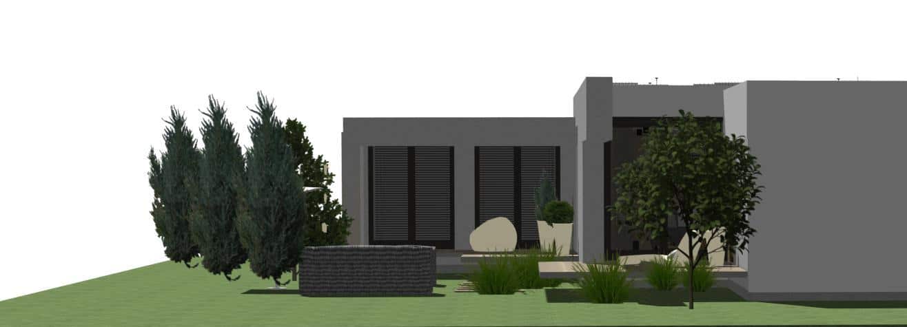
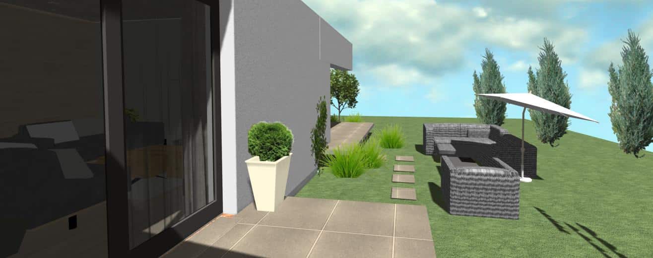
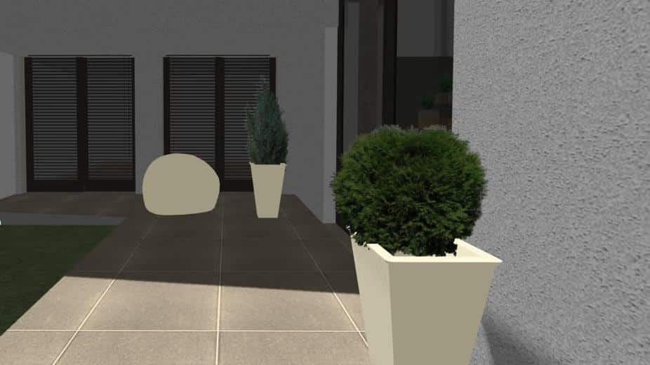
Exterior of a modern house
Design of the colour of the facade, the shape of the terrace, access paths, as well as view screens created by appropriate tree planting. Design of a dwarf conifer tree in front of the terrace - it will be clearly visible from both the living room and the two children's rooms, especially lit up at Christmas in winter.