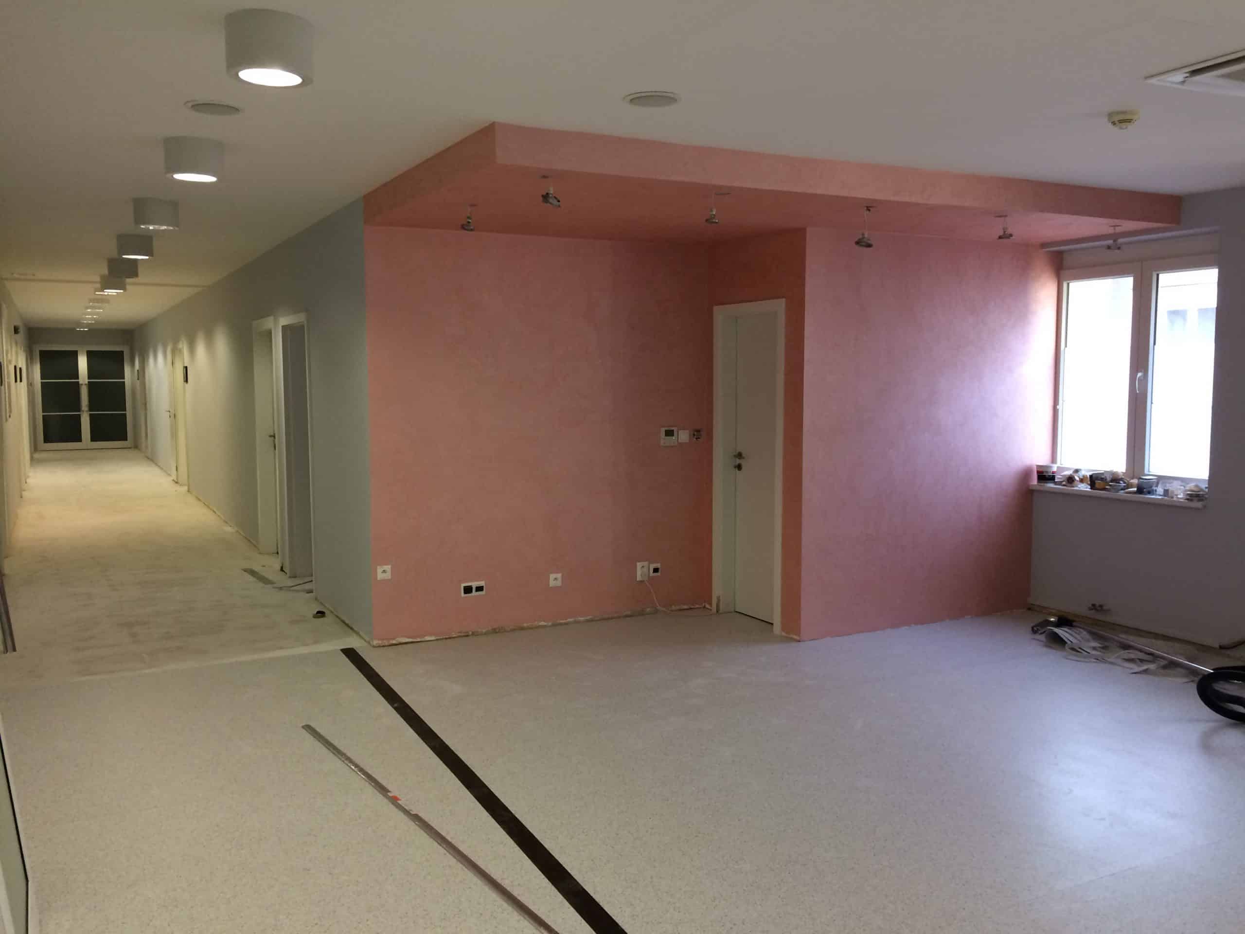
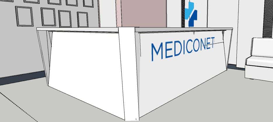
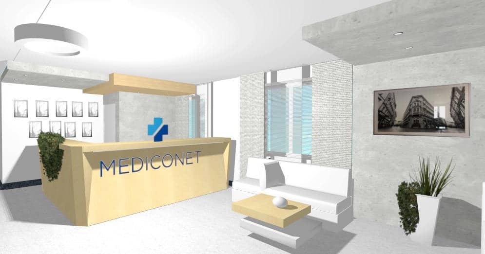
Interior design of the reception area in terms of opening up the entire space, the design of the reception itself, the design of the interior design using the existing furniture. By removing several partitions, one large open space was created. Instead of the two original receptions in smaller departments, a single elegant reception could be created in an absolutely clean design. Its central surfaces are inclined in one direction, the edge legs in the opposite direction. The reception thus takes on the meaning of the "bow" of a ship on the way to health. The illuminated front inclined surface is very elegant and minimalist.
Implementation of clinic reception

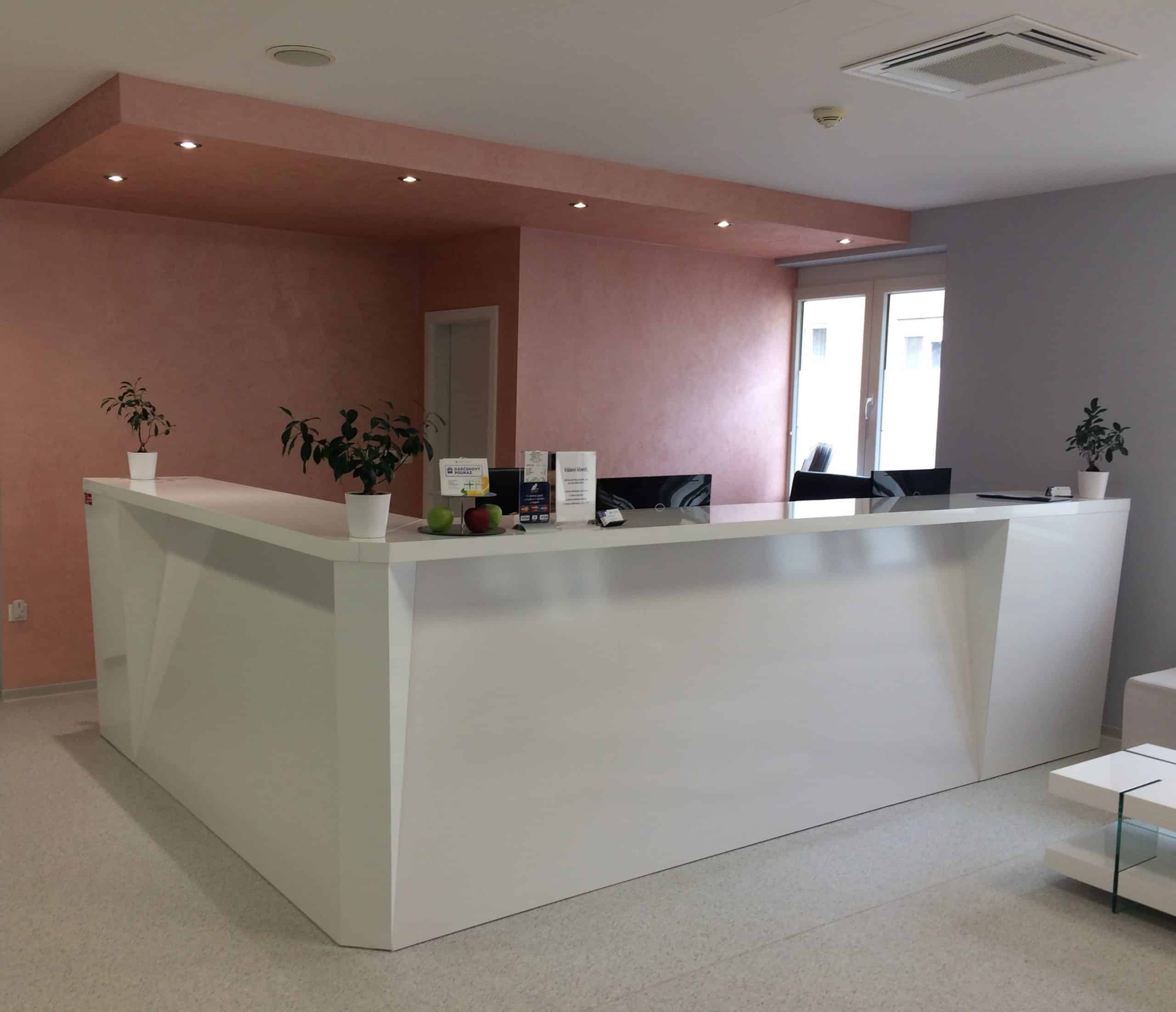
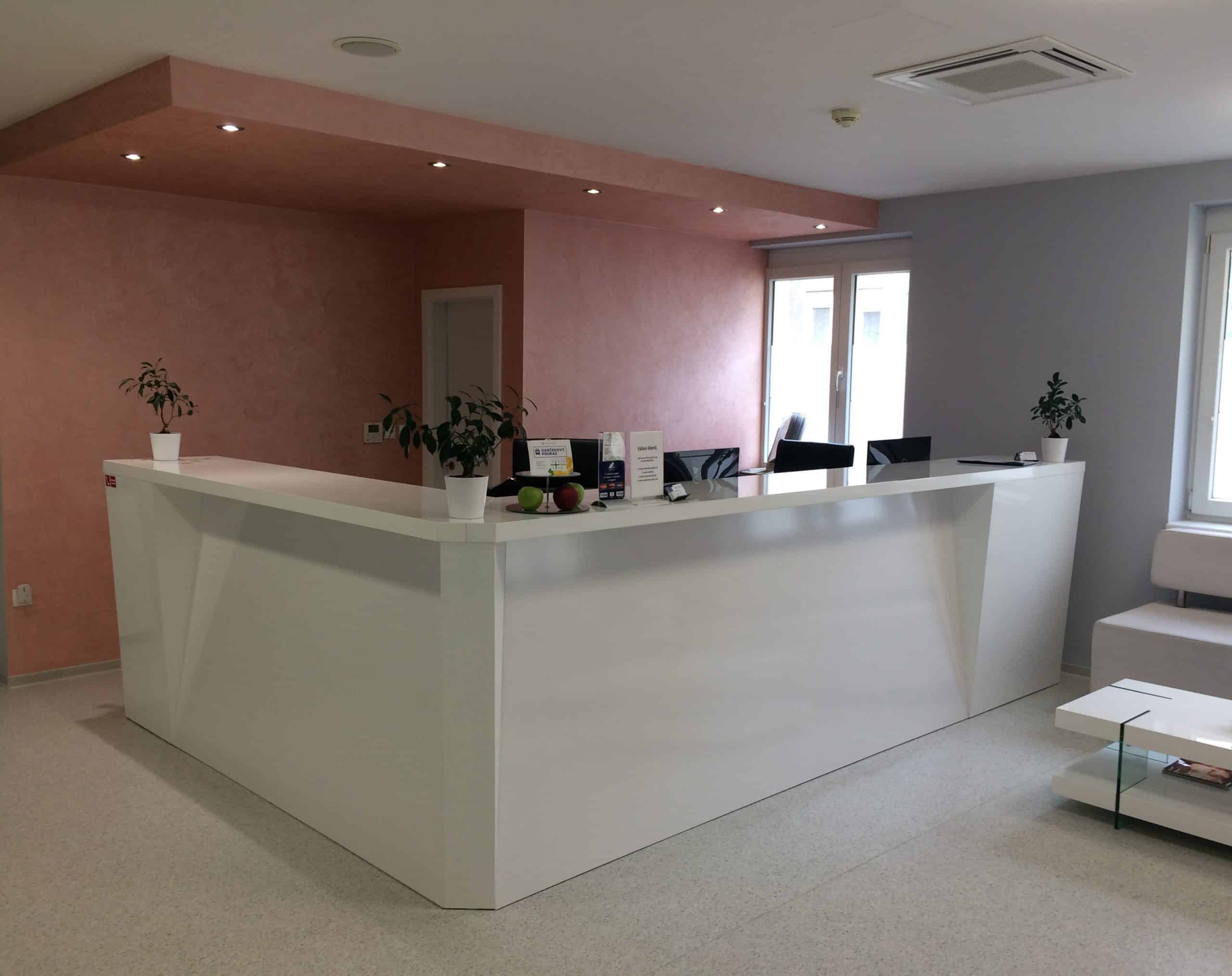


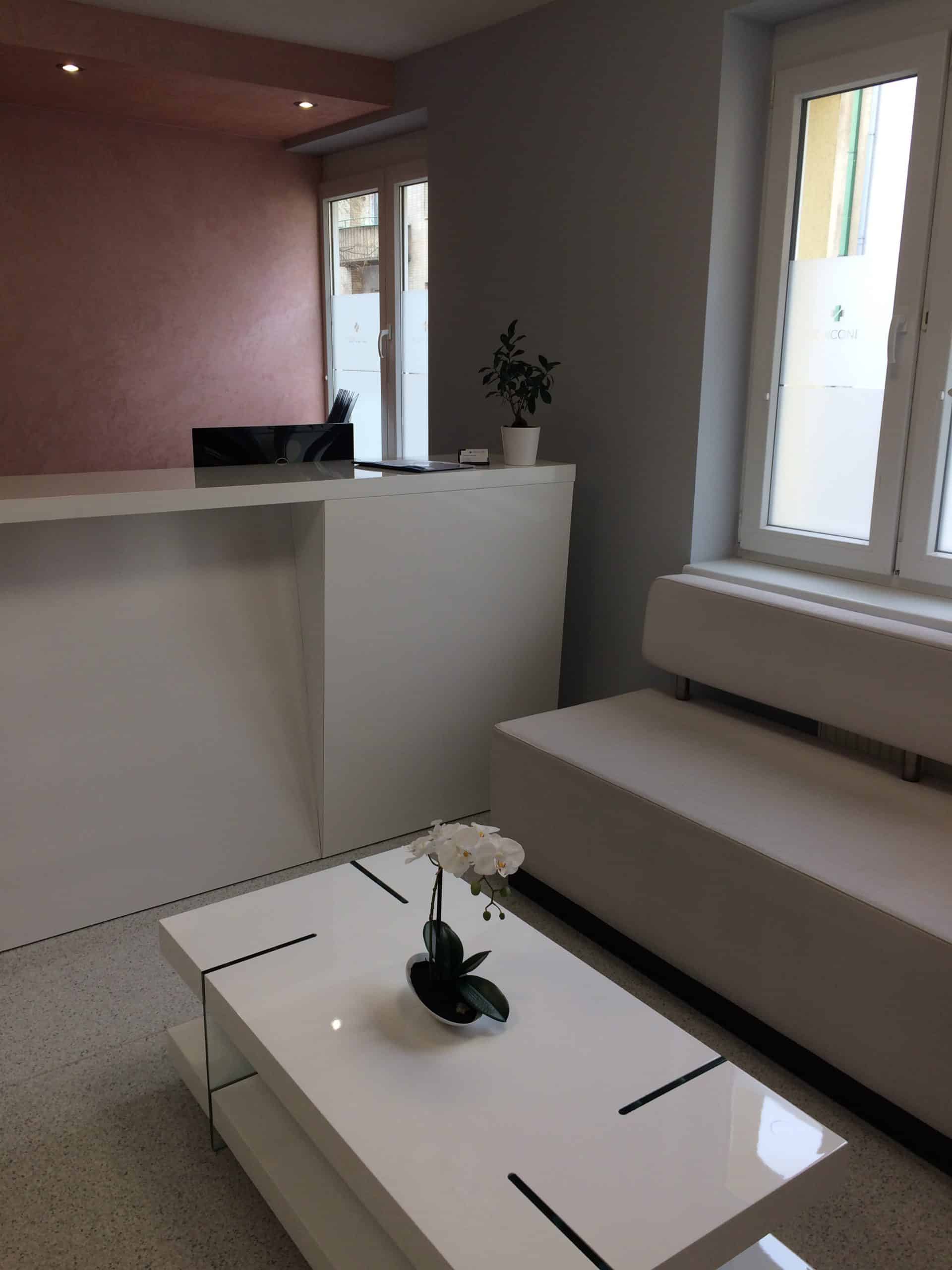
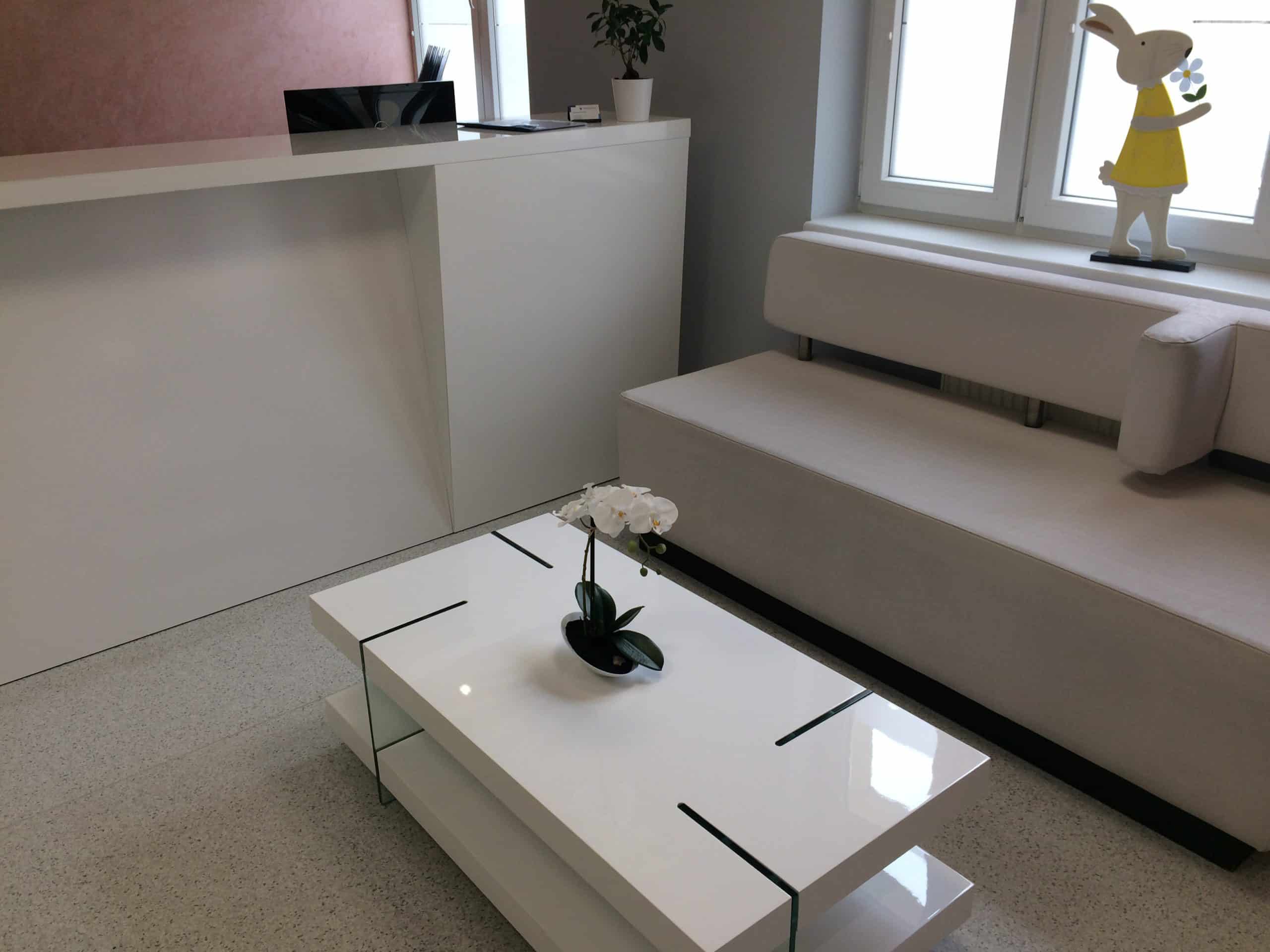
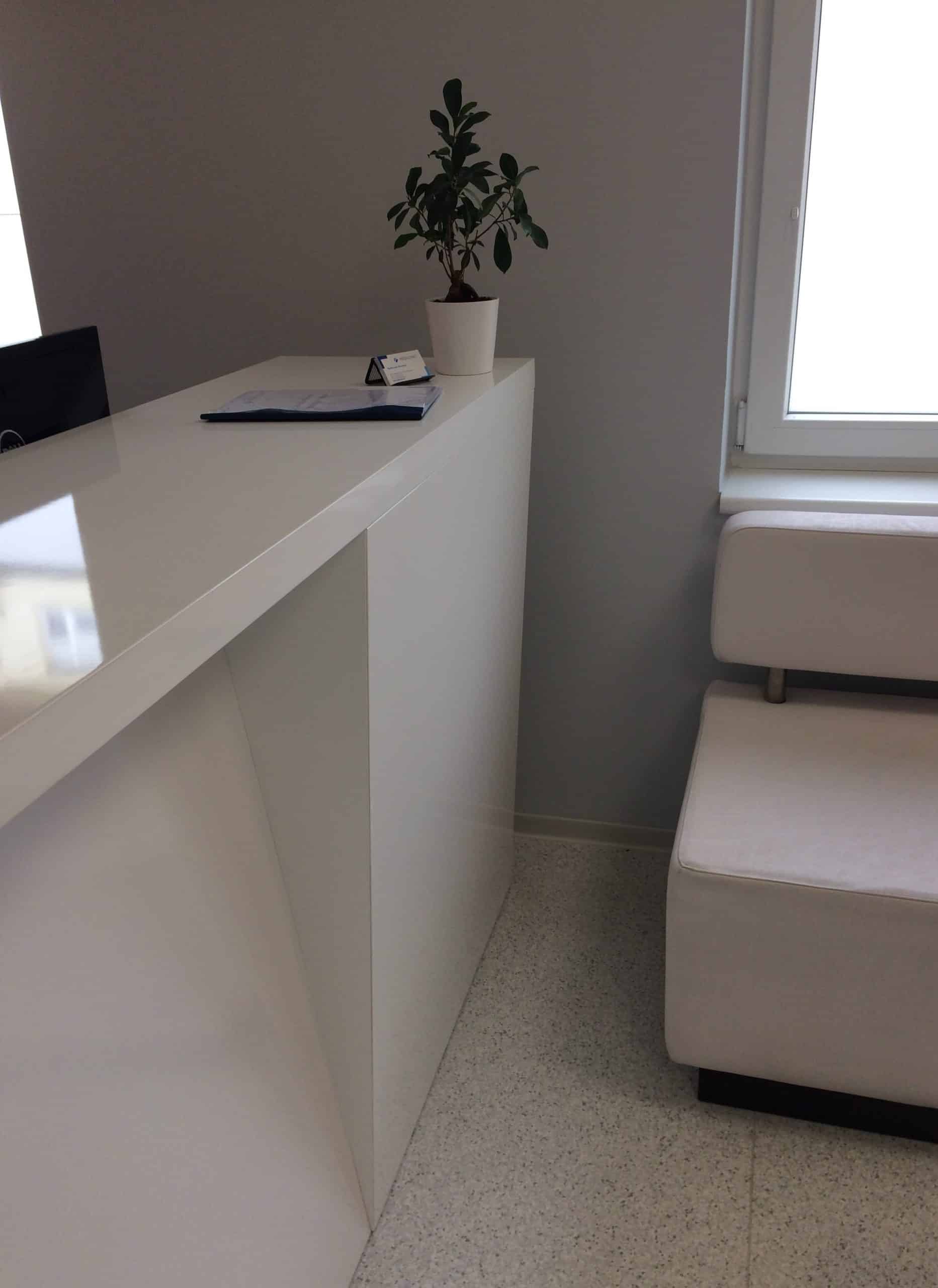
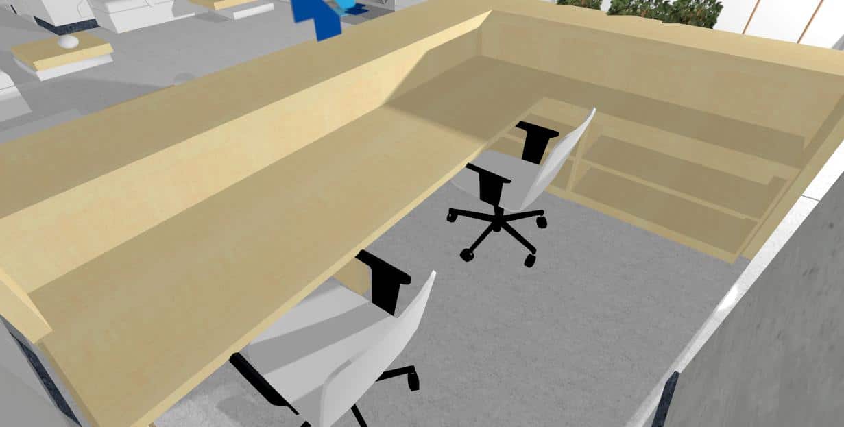
However, what looks simple was not simple at all. Both the central and the outer legs of the reception desk had to be connected to the counter at opposite angles so that everything “played”. The extension of the reception desk meant that a solid sheet with a width of 3000 mm was not enough. Since I could not accept the division of the area, I proposed to expand the right leg asymmetrically “as much as possible”. It added about another meter, but it did not harm the whole thing at all; on the contrary, the reception desk gained an additional flair and the added value of a great design with the asymmetrical and disproportionately wide leg. The interior equipment followed the possibility of conducting electricity in the hollow front part, as well as storage space for files and a printer.
Part of the plan was also to play with the logo. The original plan was to place and light a large part of it under the counter and to “put it on a shelf” in the form of an equally slanted Plexiglas base with printing, or LED lighting. This could be either fixed or mobile. In the end, the logo was placed in a different place.
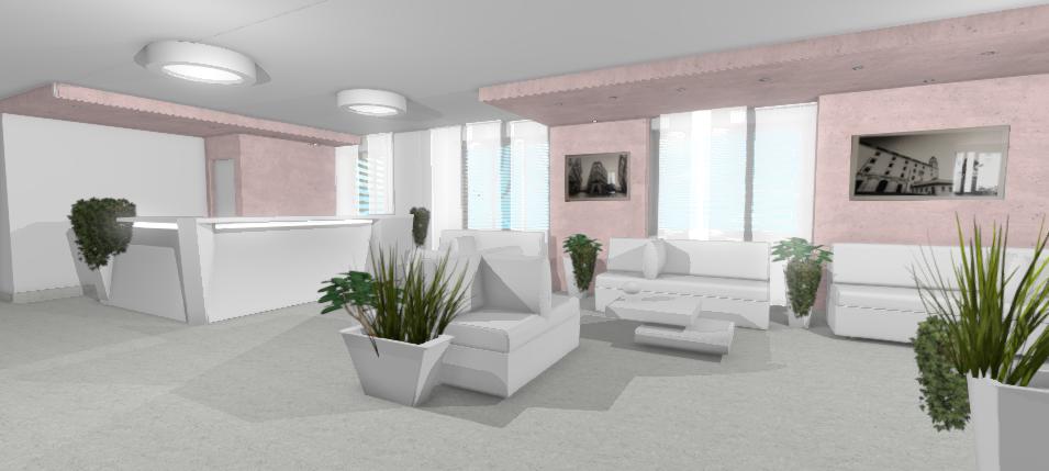
Visualization of medical clinic interior design


Medical clinic variation in wooden design


VIP lounge visualization


